Simplifying
Everyday Shopping, Personalized for You
A responsive online shop offering personalized recommendations, wish list creation, easy navigation and a simple checkout process for a stress free shopping experience.
SwypeBuy App was selected to be featured in The Best Bright Color App Designs by DesignRush, a platform known for promoting distribution app design.
About SwypeBuy
SwypeBuy is the responsive online shopping app that simplifies the way you shop for everyday goods. As an passionate online shopper for everyday goods, I've always felt a sense of frustration when encountering disorganized layouts, cluttered screens, and confusing navigation within the apps offered by larger companies. That's why I embarked on a two-week project during my CareerFoundry Bootcamp to create SwypeBuy, where simplicity and personalization take center stage.
Designed with a mobile-first approach, SwypeBuy offers a streamlined and stress-free shopping experience for busy professionals, on-the-go parents, and anyone seeking convenience. With SwypeBuy, I aimed to challenge myself by creating an app that not only streamlines the online shopping process but also provides an intuitive and engaging interface. This project allowed me to showcase my skills in UX/UI design and animation, ensuring that users can quickly find and purchase the perfect products they need.
Project Time
2 Weeks
Tools
Responsibilities
UI Design | UX Design | User Persona | User Journey | User Flow | User Research | Usability Testing | Interactive Design | Wireframing |Prototyping | Branding | Logo | Typography
Project Goal
In this project, my primary objective was to enhance the online shopping experience by addressing common pain points found in many existing apps.
User Problems
difficulty in finding products that align with their needs and preferences
challenges in moving items between the cart and wish list,
and struggles with the checkout process.
Key Features and Improvements
Streamlined and minimalistic interface to eliminate clutter and provide a more intuitive user experience
Clear feedback and visual indications to enhance navigation
Simplified and optimized checkout process to reduce friction
Impact and Benefits
Users will experience increased reengagement through personalized recommendations and the ability to save items to their wish list for future purchases
The simplified and efficient checkout process will lead to a higher completion rate, reducing cart abandonment and improving overall user satisfaction.
Don’t want to read the case study?
That’s alright.

Design Process
In this project, I followed a design process that provided a framework for organizing my workflow and guiding me through the various stages.
Discover
Define
Competitive Analysis
During the competitive analysis phase, I thoroughly examined three prominent online shopping platforms: Amazon, Walmart, and eBay. The evaluation focused on user experience, visual design, and features to gain insights and identify areas for improvement.
Here's what I discovered:
-
Cluttered screens and overwhelming amount of information.
Disorganized product placement and unclear navigation flow.
Limited personalization and difficulty in finding specific products.
Complex and time-consuming checkout process.
Lack of distinct calls-to-action and unclear user interface.
-
Personalized product recommendations based on user behavior and purchase history.
Clean and organized interfaces with clear calls-to-action.
Integration of user-generated reviews for trust and insights.
Implementation of intuitive navigation and search functionalities.
Additional shopping cart options for flexibility and item management.
Responsive design for seamless experience across devices.
The User
As a UI/UX designer, I understand the importance of putting users at the center of the design process. To ensure that SwypeBuy meets the needs of its target audience, I created user personas that represent the diverse range of users I aim to address.
One of these personas is Alex Diaz.
Age: 32
Gender: male
Occupation: software engineer
Context: Alex has a demanding career and a busy lifestyle and values efficiency and convenience in his everyday life. He frequently turns to online shopping to save time and easily find the products he needs.
User personas like Alex Diaz enable me to empathize with their unique experiences and allow me to understand their needs, preferences, and pain points on a deeper level. By putting users at the center of my design process, I am committed to delivering tailored solutions that resonate with their desires.
User Flow
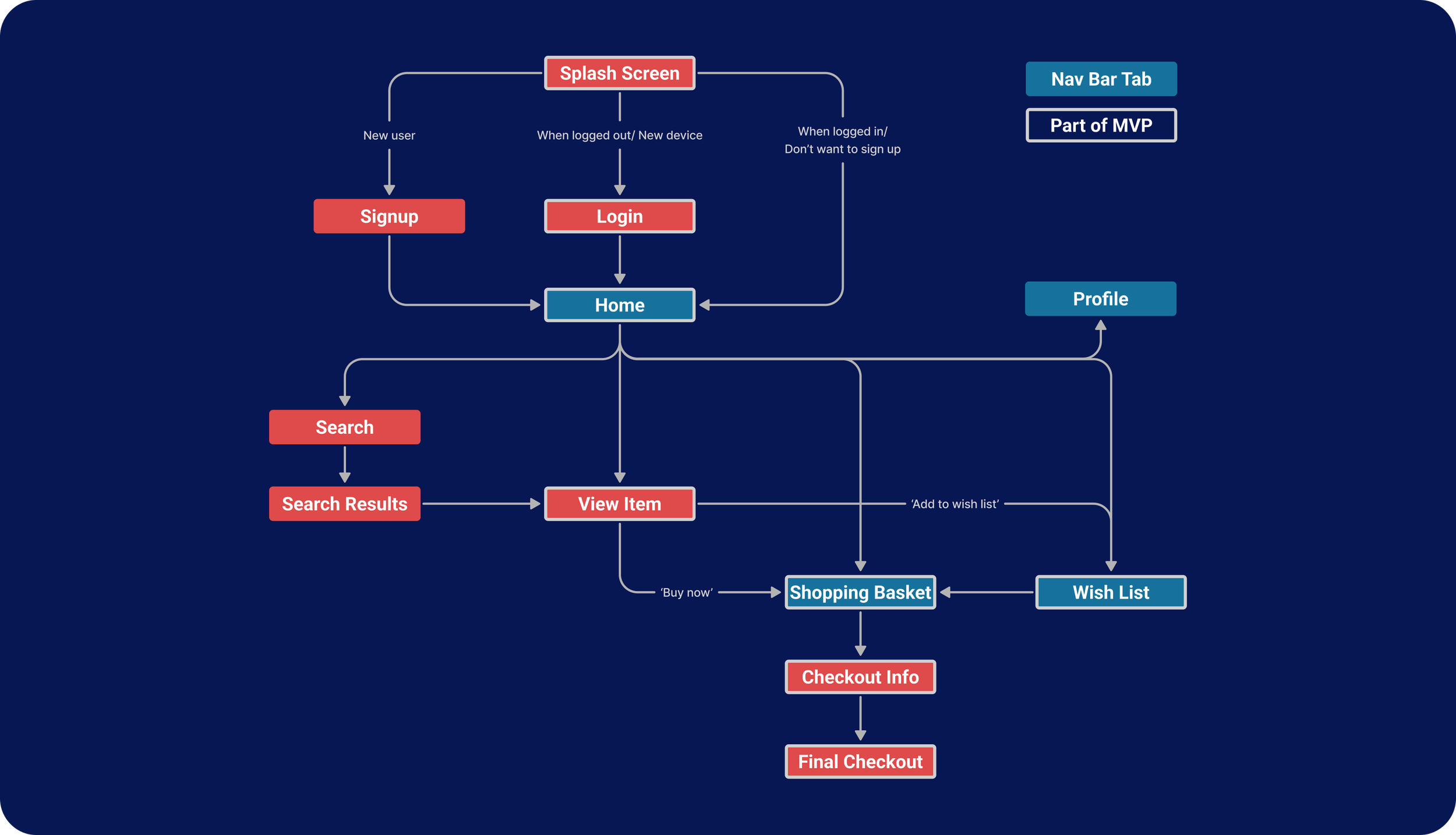
The user flow I’ve created outlines the steps a user takes from entering the site to completing a purchase, and it was essential to ensure that this process was both efficient and user-friendly.
To ensure clarity in the user flow for the e-commerce platform, I used white outlines to indicate MVP screens and blue to highlight screens in the bottom navigation bar.

Develop
Sketches
As a visual and creative person, I find the ideation and wireframing phase of the design process to be one of the most exciting parts of my work. When working on the e-commerce platform, I started by sitting down with pen and paper to sketch out some rough ideas of possible solutions.
Wireframes and Usability Test
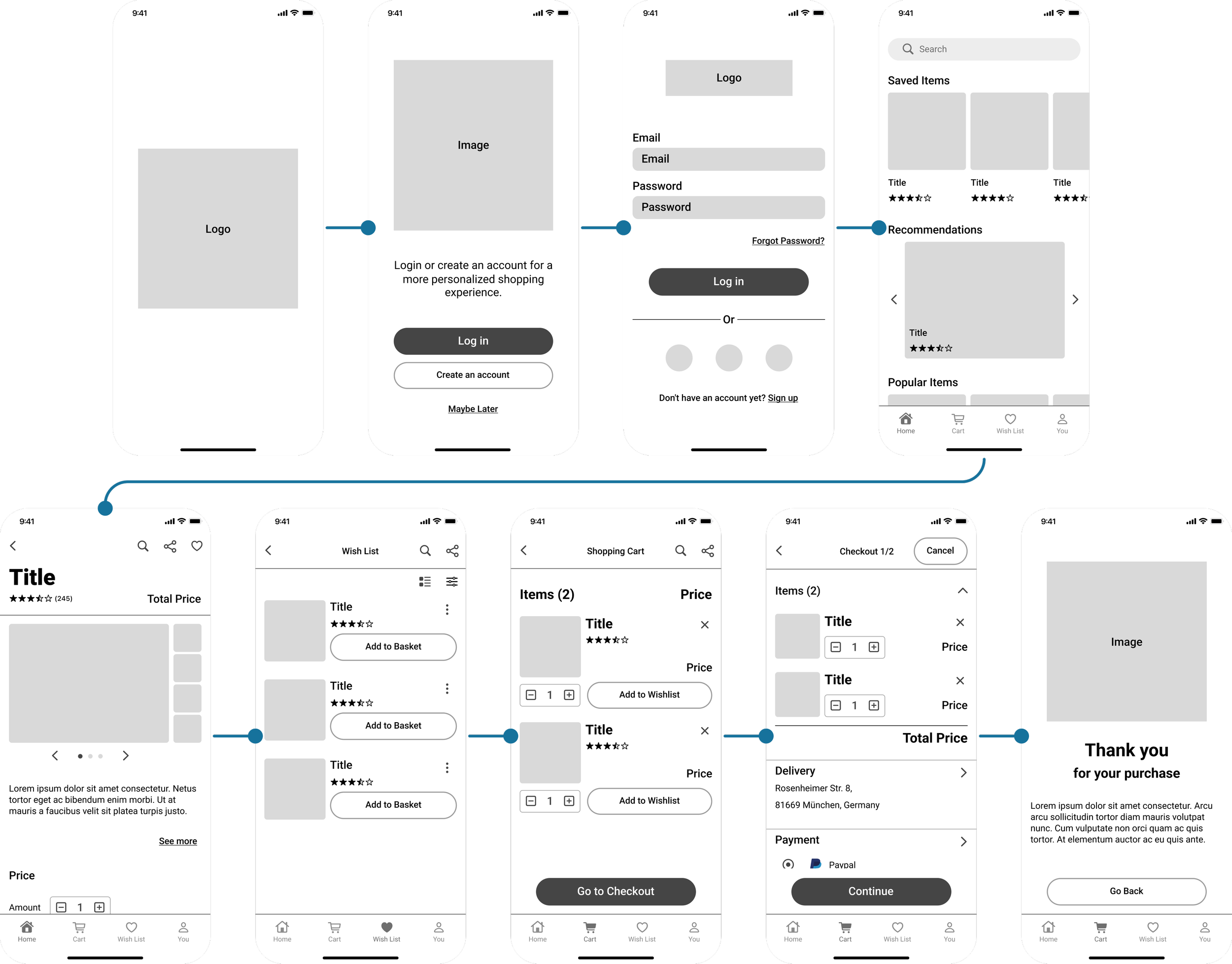
After creating initial sketches, I developed low to mid-fidelity wireframes to gather early user feedback and identify any significant issues or obstacles. This iterative approach allowed me to make necessary adjustments before investing substantial time and resources.
By incorporating multiple rounds of feedback and continuously refining the design, I progressed towards high-fidelity wireframes that aligned with the platform's vision. Throughout this process, I learned a valuable lesson about the significance of iteration. By actively seeking user feedback, I ensured that the final product effectively addressed both business objectives and user needs.
Brand Guidelines
To create a strong brand identity for SwypeBuy, I needed to establish a comprehensive brand guideline. This ensured consistency and provides clear guidelines for future designers and developers. The guideline included elements such as color palette, typography, iconography, imagery, tone of voice, and messaging.
Logo
The SwypeBuy logo is a button with a dripping border on the left, designed to visualize the "swyping" motion of a button. It conveys a sense of movement and momentum, reflecting the brand's emphasis on getting things done quickly and easily.
Overall, the SwypeBuy logo is an essential visual element of the brand identity, representing the brand's core values and embodying the key elements of the SwypeBuy shopping experience. It is used consistently across all communication channels to create a cohesive and recognizable brand image, reflecting the brand's commitment to providing a fast, easy, and enjoyable shopping experience to its customers.
Color
The colors for SwypeBuys brand identity creates a bold and eye-catching image that resonates with the target audience. The brand's focus on efficiency and innovation was emphasized through a color scheme consisting of red, orange, and blue.
In addition to representing the brand values, these colors were chosen for another important reason: their psychological impact on users. Red is associated with excitement, energy, and urgency, while orange is associated with friendliness, warmth, and enthusiasm. Blue, on the other hand, is associated with trustworthiness, stability, and professionalism.
By using these colors consistently across all aspects of the platform, I was able to create a memorable and cohesive brand identity that resonates with the users and helps build brand recognition. Overall, the color scheme I chose was a key element in creating a strong and effective brand image for SwypeBuy.
Typography
In the design of SwypeBuy, typography played a crucial role in creating a clean and modern visual aesthetic. After careful consideration, the decision was made to use the Roboto font family throughout the platform.
The Roboto font is known for its readability and versatility, making it an ideal choice for an online shopping platform that prioritizes a user-friendly experience. The font's clean and simple design also aligns with SwypeBuy's minimalistic design approach, which allows for less distractions and a more seamless shopping process.
User Interface
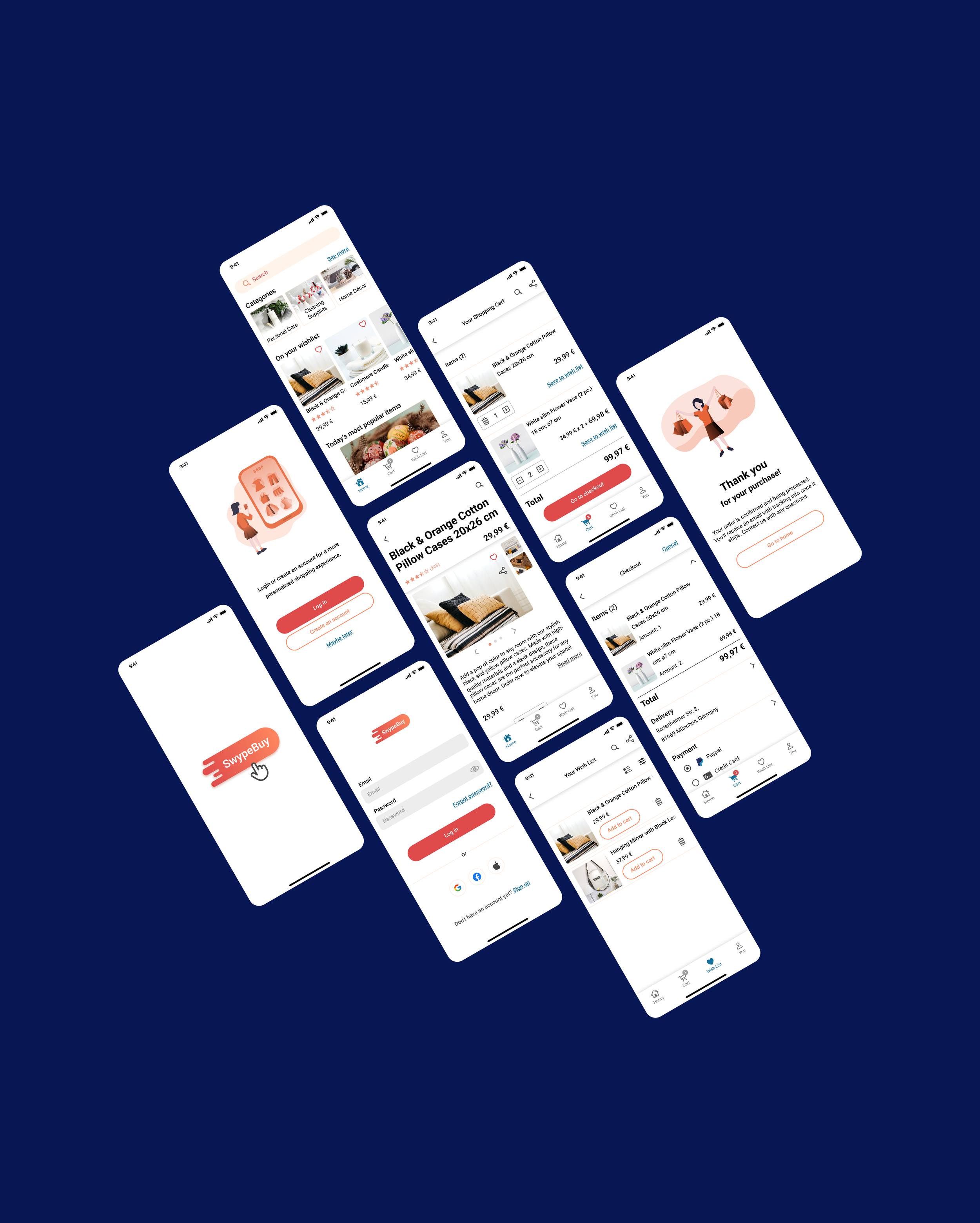
The SwypeBuy user interface is designed to be intuitive and user-friendly, with easy access to the inventory and advanced filtering options to help customers find what they're looking for quickly. The shopping cart and wish list allow for convenient purchasing and saving of items for later. The SwypeBuy user interface is a key element of the brand's commitment to providing a fast, easy, and enjoyable shopping experience for all customers.
Want to test it out?
Onboarding Process
The onboarding process of SwypeBuy is designed to provide a seamless signup experience, allowing users to quickly create a personalized account for a more tailored shopping experience. However, for those who prefer to skip the signup process, SwypeBuy also provides the option to jump directly into shopping. The use of contrast in the design of the onboarding process also ensures that users can easily navigate and interact with the platform, resulting in a smoother and more enjoyable user experience.
Feedback
SwypeBuy utilizes animated feedback to provide a more engaging and intuitive user experience. By providing visual cues for actions like adding or removing items from the wishlist or cart, users can more easily understand the effects of their actions and feel more in control of their shopping experience.
Checkout Process
SwypeBuy offers a seamless and lean checkout process to ensure that the purchasing experience is quick and easy for users. By simplifying the checkout process and removing unnecessary steps, SwypeBuy reduces the likelihood of user frustration or abandonment, making it more likely for customers to complete their purchases.

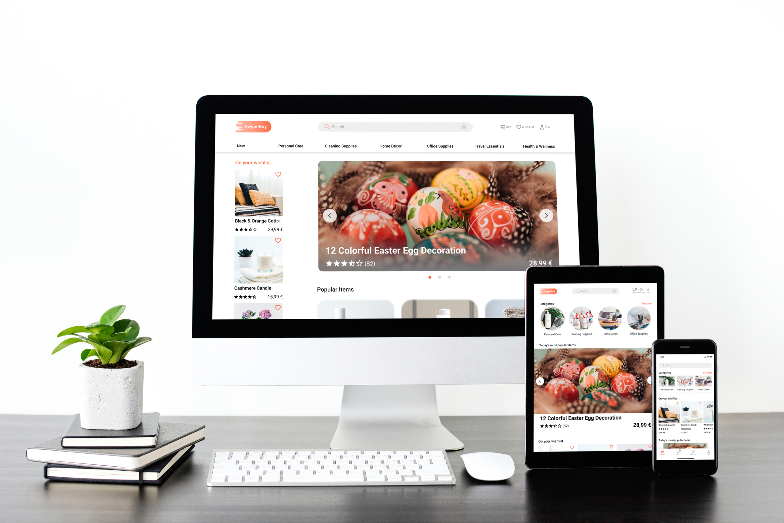
Responsive Layout
SwypeBuy was designed to be responsive to any device size, ensuring a seamless user experience on all devices. This was important to me because I wanted the users to have the same convenient and personalized shopping experience, regardless of the device they use to access the platform. The benefit of a responsive layout is that it eliminates the need for separate designs for different devices, streamlines the development process, and ultimately provides a more consistent and user-friendly experience for our customers.
Retrospect
What went well?
As the sole UX/UI designer for SwypeBuy, the retrospective analysis has been a valuable learning experience. What went well was the user feedback loop, which allowed for constant iteration and refinement of the mid-fidelity prototypes to get to the high-fidelity wireframes. Additionally, getting the idea for the logo and integrating visual feedback for users were successful aspects of the project.
What didn't go well?
However, I encountered some difficulties during the color palette selection process. It was challenging to find the right colors that represented the values and vibe of the brand.
What can be improved?
Moving forward, there is still room for improvement in terms of personalization. While the platform currently offers some personalized recommendations, there is the opportunity to further enhance this feature. Additionally, the next steps for the project involve continuing to develop advanced and personalized search filters to improve the user experience.
Want to see more?
Click on the ‘View Case Study’ on the top nav bar to jump to another case study.


